How to serve Images on Web
There are excellent articles about modern <picture> HTML5 element and responsive images, and there is also 100% SVG support for more or less recent browsers … yet the amount of even famous websites unable to serve images right is unbelievable.
Take Smashing Magazine as example: as soon as I’ve done some advertisement related business with them I’ve told them they were unable to serve high quality images for my own ads. Despite I’ve managed to make those images fit at doubled resolution within their regular data size constrains, they couldn’t just serve my high resolution images due some automation gotcha (or some other irrelevant reason I don’t remember).
The bummer here is that they sell an excellent book about real-life responsive design, and yet they couldn’t serve the right images accordingly with the screen pixel density.
an example I've discussed 7 months ago still not fixed is the following one: even ads are blurry and misrepresented pic.twitter.com/6BzLk28mDi
— Andrea Giammarchi (@WebReflection) February 3, 2016
Please bear with me, this is not an attack to anyone in particular, I’ve shown indeed similar examples for two other companies I’ve worked for and respect: Facebook and Twitter.
… and Facebook too, failing on Desktop Web same exact way for HiDPI screens … pic.twitter.com/yyS7sEIuUR
— Andrea Giammarchi (@WebReflection) February 6, 2016
… and Twitter too, failing on Desktop Web same exact way for HiDPI screens … pic.twitter.com/8CQGIlv5Ng
— Andrea Giammarchi (@WebReflection) February 4, 2016
At this very time, even if they fixed other broken images on their website few days ago (ahem … after me complaining …), and kudos regardless to Leanpub for their always prompt answers and assistance, my recent book cover preview looks blurry on my very own screen.
It’s not about high end, it’s about UX!
HiDPI screens are everywhere, not only on Apple’s devices. The Motorola Moto E is a “less than $100 Android phone“ with 256 ppi pixel density. My 2012 good old NOKIA Lumia 620 Windows Phone has 1.4879... value as window.devicePixelRatio and 246 ppi pixel density, meaning it can render 1.5x images in a close to optimal way.
If you are wondering how much difference there could be between a regular image and one at 1.5x, check out this screenshot crop from my Lumia:

It’s not about mobile, it’s about UX!
Many developers wrongly assume that HiDPI screen means mobile, portrait or landscape, with min or max resolution constrains that shoud decide the quality of each image.
Even worst, the amount of web services that base images resolution on UserAgent sniffing still in 2016 is embarrassing.
For how many years do we have to restate and re-demonstrate that UserAgent sniffing does not work and does not scale?
The basic Surface Pro 3 with an i3, 4GB of RAM and 64GB HD, which is already an excellent machine in 90% of common use cases, is a £549 VAT included computer with a HiDPI screen.
The new HP Envy with its stunning QHD+ 3200x1800 HiDPI display costs £588 VAT included, which is way less than a MacBook/Pro with retina screen.
Then we have other £550 or more products from Lenovo, Asus, and Apple, with HiDPI capable screens … and we also have HiDPI screens with external computers.
The point is: it is not just mobile and it is disturbing to see blurry, low quality images, specially when a laptop is connected through ADSL, Fiber optic, or any WiFi where data-roaming has no costs whatsoever.
Can you imagine, most of the time I travel abroad I use more bandwidth I pay for on international data-roaming on my phone, but I see blurry images all over the Internet at home on my Laptop?
Enough of this rant though, let’s rather talk about how to fix this problem.
Avoid Images whenever is possible
Use SVG for anything icon related: it will scale forever and for free!
If you really want to do ugly UserAgent sniffing, do it blacklisting all known UAs that do not support SVG. This is way easier than pretend to know every present and future device that will support them because it’s the past that we know, not the future.
<img src="/img/icon.svg" width="16" height="16">

<!-- somewhere in your server with redirect rules for images
     the method `doesNotSupportSVG` is just an example       -->
<?php
$header = 'Content-Type: image/svg+xml';
$file = $_GET['image'];
if (doesNotSupportSVG($_SERVER['HTTP_USER_AGENT'])) {
  $header = 'Content-Type: image/gif';
  $file = str_replace('.svg', '.gif', $file);
}
header($header);
echo file_get_contents($file);
?>
The same could be for any CSS url image, I am sure you got the point here, but how to serve images when SVG is not a reasonable solution?
Use at least the srcset attribute!
OK, maybe there are still so many cases with low res images because the picture element is not widely supported, fair enough, but how about we gracefully promote to HiDPI images any browser that meanwhile started supporting the Image.srcset property?
It’s deadly simple to implement because it works on existing images already!
<!-- all you need to add basic HiDPI support -->
<img
  width="256"
  src="/img/blog/goku.png"
  srcset="/img/blog/goku@1.5x.png 1.5x,
          /img/blog/goku@2x.png 2x"
>
The standard srcset attribute has the following advantages:
- if the browser supports it, it will download the supported resolution only
- if the browser doesn’t support it, nothing happens
Since gzip compression works best with similar strings per each compressed chunk, this technique is also ideal in terms of compression because it will not increase O(n) images times the size of the page, it will just compress nicely all strings containing the same image path less the resolution info, as long as we use a naming convention for that, like I’ve done in the previous example where all /img/blog/goku occurrences will be nicely packed.
You can check directly on the test page, which will reveal your browser capabilities.
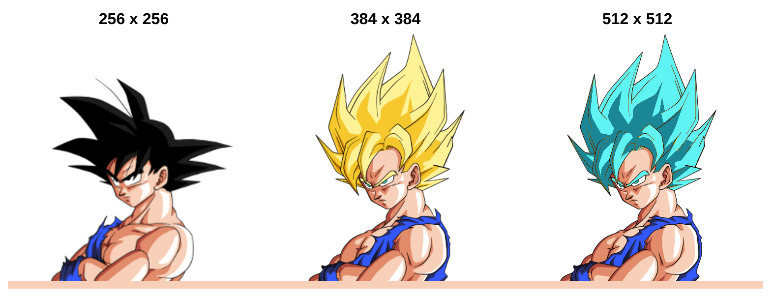
If you’ll see normal sayan, either you are on regular screen or your browser does not support srcset attribute. In other cases, your screen is 1.5x up to 2x capable.
Feature detection and possible fix
It’s actually pretty easy to know upfront if a browser might need srcset feature but it doesn’t support it.
(function (dPR) {
// in both following cases we don't need to do anything
// old browsers or srcset is already supported
if (dPR <= 1 || 'srcset' in Image.prototype) return;
// the dPR value might not be precise
dPR = dPR.toFixed(1);
// we can intercept when the HTML is ready
document.addEventListener('DOMContentLoaded', function DCL(e) {
// clean up this listener
document.removeEventListener(e.type, DCL);
// fix each image on the document
fix({target: document});
});
// we can also intercept and fix ASAP at runtime
document.addEventListener('DOMNodeInserted', fix, true);
// fix an event.target, if image, or fix every image in it
function fix(evt) {
var target = evt.target;
// in case it's an image, fix it directly
if (target.nodeName === 'IMG') fixImage(target);
// in case its a container, fix images in its content
else if ('getElementsByTagName' in target) {
for (var
img = target.getElementsByTagName('img'),
i = img.length;
i--;
fixImage(img[i])
) {}
}
}
// it parses srcset and replace the src once
function fixImage(img) {
var srcset = img.getAttribute('srcset');
// there is some value to actually parse
if (srcset) {
// let's avoid repeating this fix next time same image comes through
img.removeAttribute('srcset');
// looping backward each possible `srcset` assuming
// it contains resolutions lower to higher
for (var
tmp, s,
src = srcset.split(/\s*,\s*/),
i = src.length;
i--;
) {
tmp = src[i];
s = tmp.lastIndexOf(' ');
if (parseFloat(tmp.slice(s + 1)) <= dPR) {
// found suitable resolution for the image
img.src = tmp.slice(0, s);
// after using such resolution, we can break this loop
break;
}
}
}
}
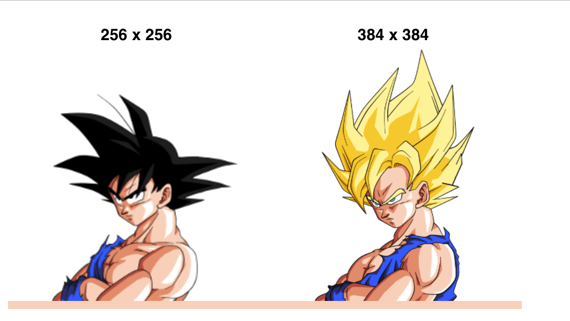
}(window.devicePixelRatio || 1));The script is already used in the Goku test page so in case you see a super sayan, you are probably on IE mobile in some Windows Phone, or maybe a Blackberry device.
This technique might have undesired side effects, like downloading, in devices that don’t support srcset already but have HiDPI screens, 2 images instead of one. The goal though is to grant a satisfying visual experience even on outdated browsers behind good screens.
If none of the above works for you …
It doesn’t matter if screens are offering higher and higher pixel density, human eyes aren’t changing, or evolving, that quickly.
Yeah, HiDPI looks good, better, sharper than ever, and I really wouldn’t come back for any reason, but a 1.5x resolution can be also considered good.
The following screenshot has been taken from an Apple retina screen, comparing base version with the 1.5x one.
I mean, that’s not so bad. It could be a bit sharper but it won’t disturb as much as serving just the base-resolution version.
What I am saying is that if none of the previously mentioned solutions work for you, your boss, or your environment, you might consider serving right away 1.5x images achieving the following:
- most mobile devices will show 1.5x sharp enough
- HiDPI Desktop and Laptop screens will look sharp enough
- desktop and laptop that don’t support HiDPI won’t be much affected in terms of used bandwidth. ADSL, fiber optic, etc.
Of course this solution is full of little caveats and compromises, but I think it’s not as bad as it sound. After all, at the very beginning of HiDPI screens, many websites, including famous one, started serving by default 2X assets trusting browser ability to eventually scale and adjust everything for us, looking still sharp on those rare, but gorgeous, retina screens.
When HiDPI should NOT matter
If you have a huge background image, a landscape, a gallery of Full HD pictures, you probably don’t want to serve these kind of images at double, or even 1.5x, resolutions.
These will look just fine, it will look like anti-aliased, it will not matter if the ray of light within some tree branches looks sharp, it will look just OK.
Of course the content and the context of the image is very important, but not every image has to be served in that high quality. Your eyes in this case are the best guide: trust them, verify with a HiDPI screen how anything you are doing online look, without ever considering mobile only or mobile specific behaviors: just check them as if it was your laptop screen.
I hope after reading this post things will change for better and in case you’d like to improve even more through CSS, here a must read post with solutions and very interesting comments.

